
Creating animated signatures for portfolio websites in CSS can be a great way to add a unique touch to your website and make it stand out from the crowd.
In this article, I will show you, how to add animated signatures to your portfolio websites with just very little CSS code.
So, whom we are waiting for, let’s get started!
Step 1: Create a SVG Signature
-
Create a new design file.
-
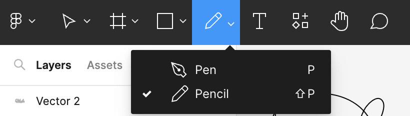
Choose Pen (Shift + P) or select from the top toolbar.
-
Draw your signature.
-
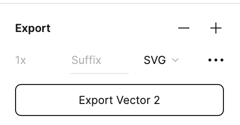
Select your signature and export as SVG from the right corner.
-
Open that SVG file in any text editor (e.g Notepad) and copy the SVG code.
Step 2: Create HTML File
- Paste that SVG code of your signature inside the body tag.
- Add
id="signature"to<path>of the SVG.
<svg
      width="400"
      viewBox="0 0 1481 586"
      fill="none"
      xmlns="http://www.w3.org/2000/svg"
    >
      <path
        d="M56.0459 87.3021C56.0459 187.172 48.4006 287.063 48.4006 387.169C48.4006 402.237 49.6825 411.472 47.9758 390.992C43.1774 333.41 40.7552 276.821 40.7552 218.972C40.7552 143.091 24.4919 79.8668 99.7942 38.0322C214.222 -25.5387 393.795 2.66325 440.861 134.448C474.084 227.474 488.161 453.875 367.806 498.451C314.155 518.322 221.626 516.988 166.903 500.15C145.55 493.58 103.91 454.604 88.3262 437.288C64.9185 411.28 36.9564 393.986 10.1739 370.179C-7.65725 354.329 11.1372 362.534 29.2872 362.534C80.0584 362.534 130.025 363.083 179.645 349.792C288.951 320.514 423.681 221.669 467.195 113.636C475.119 93.9612 493.224 55.6212 479.088 35.059C458.849 5.62072 418.65 49.7205 409.43 66.065C393.46 94.3754 379.5 136.697 380.548 169.702C381.858 210.981 443.609 223.858 473.141 236.811C529.712 261.623 584.076 293.499 603.112 356.588C618.948 409.073 605.446 480.603 552.143 506.096C514.889 523.914 472.951 521.923 455.302 479.762C423.79 404.483 499.155 332.796 547.046 286.081C630.48 204.694 738.92 124.184 774.707 7.87558C780.379 -10.5597 779.584 46.4089 778.105 65.6403C768.561 189.715 763.569 314.254 751.771 438.138C748.318 474.393 736.48 512.644 736.48 548.995C736.48 570.581 751.198 508.28 761.115 489.107C767.996 475.804 866.1 333.8 877.919 357.437C894.538 390.675 877.3 572.419 914.022 582.55C939.361 589.54 985.857 549.655 1002.37 534.979C1043.22 498.67 1077.18 449.03 1079.25 393.115C1080.32 364.205 1071.84 283.79 1025.3 291.178C974.844 299.187 950.261 383.488 935.684 422.847C933.436 428.916 903.523 496.349 917.42 498.876C946.054 504.082 986.13 456.83 1004.07 440.686C1013.88 431.853 1087.03 343.685 1087.74 349.367C1091.8 381.88 1088.17 416.896 1088.17 449.606C1088.17 476.644 1079.95 535.707 1093.26 472.967C1128.81 305.402 1194.12 147.481 1285.25 3.20343C1292 -7.48852 1291.32 74.8062 1291.19 76.2588C1278.97 210.02 1255.63 342.714 1241.92 476.364C1241.09 484.485 1224.92 537.051 1238.52 519.688C1273.21 475.439 1315.77 437.902 1354.9 397.787C1374.77 377.423 1397.65 350.082 1423.71 337.05C1441.57 328.12 1439.77 395.182 1439.85 402.46C1440.39 453.435 1419.5 500.15 1478.08 500.15"
        stroke="black"
        stroke-width="20"
        stroke-linecap="round"
        id="signature"   <!-- Add id Here -->
			/>
</svg>
Step 3: Get total length of SVG Path
- Open Developer Tools.
- Go to Console Tab.
- Paste the following code,
const svg = document.getElementById("signature")
svg.getTotalLength() // Total Length of SVG Path
The total length of the SVG path will help us determining the total length and animate the SVG.
Step 4: Animating the SVG Signature
Inside CSS file, add the following code,
#signature{
    stroke-dasharray: 7550; /* Total Length from the above Javascript Code */
    stroke-dashoffset: 7550; /* Total Length from the above Javascript Code */
    animation: sign 6s ease-in forwards;
}

@keyframes sign{
    to{
        stroke-dashoffset: 0;
    }
}See the Pen by Dhairya Shah (@dhairyathedev) on CodePen.
Conclusion
In this article, you have learned to animate your signature in four simple step:
- Create SVG of a signature
- SVG Signature inside HTML
- Get the total length of SVG path
- Animate the signature
I hope you have enjoyed reading the article, thanks for reading!