
Shadows are a critical function in the world of web design and can serve a number of useful functions. Shadows add depth, dimensionality, and direction to your content.
There are two properties of shadows in CSS,
- Box shadow
- Drop shadow
These properties are used to give shadow to the content. In this article, you will know what’s the difference between box-shadow and drop-shadow.
Structure
I will take the transparent SVG logo of Firefox as an image in the example,
<div class="container">
  <img src="https://interactive-examples.mdn.mozilla.net/media/examples/firefox-logo.svg" class="box-shadow"/>
  <img src="https://interactive-examples.mdn.mozilla.net/media/examples/firefox-logo.svg" class="drop-shadow"/>
</div>
Box Shadow
As of the name, the box-shadow property gives shadow to the box of the content.
Here’s how you would add a box-shadow to an image,
.box-shadow{
     box-shadow: 2px 3px 10px #000000;
}
See the Pen by Dhairya Shah (@dhairyathedev) on CodePen.
As we can see in the example, it puts a shadow on the image around the box of it.
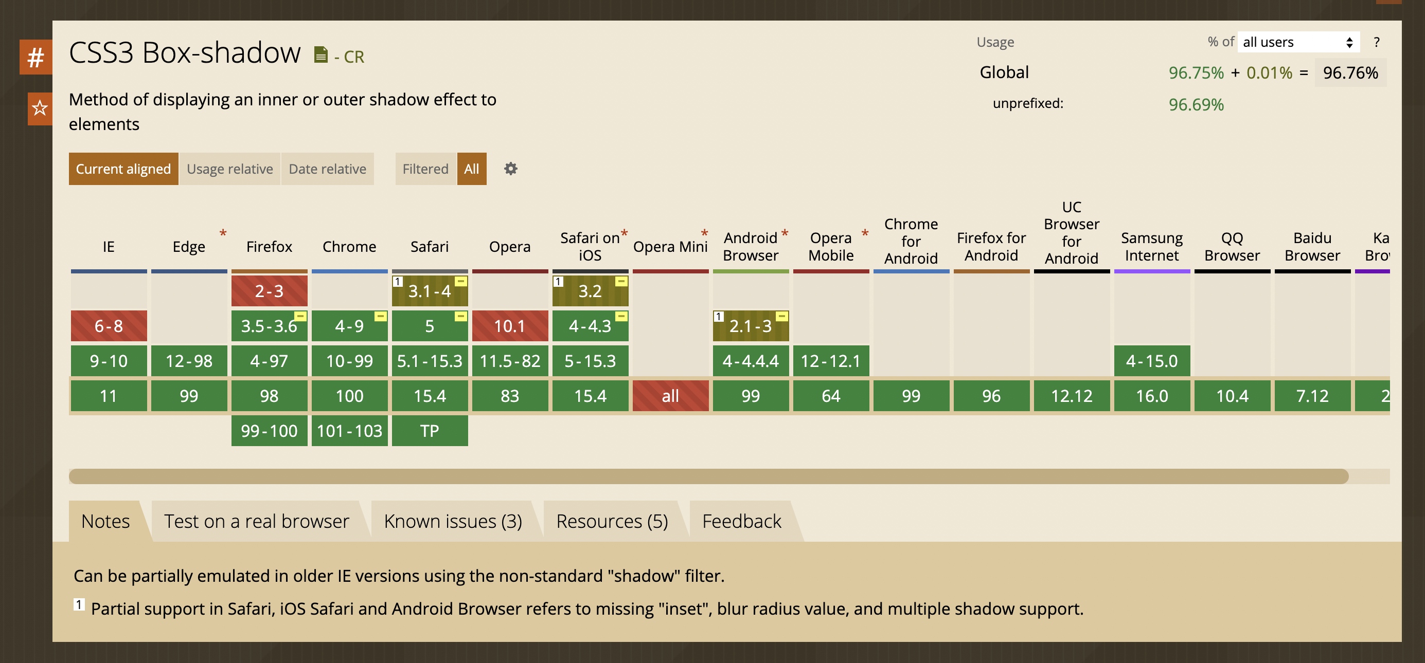
Browser support
Drop shadow
In CSS, drop-shadow is part of filter property. Drop shadow gives shadow to the area of the image.
Syntax
drop-shadow(offset-x offset-y blur-radius color)Example,
.drop-shadow{
  filter: drop-shadow(0 0 0.75rem crimson);
}
Here’s how it looks after giving drop shadow to the images,
See the Pen by Dhairya Shah (@dhairyathedev) on CodePen.
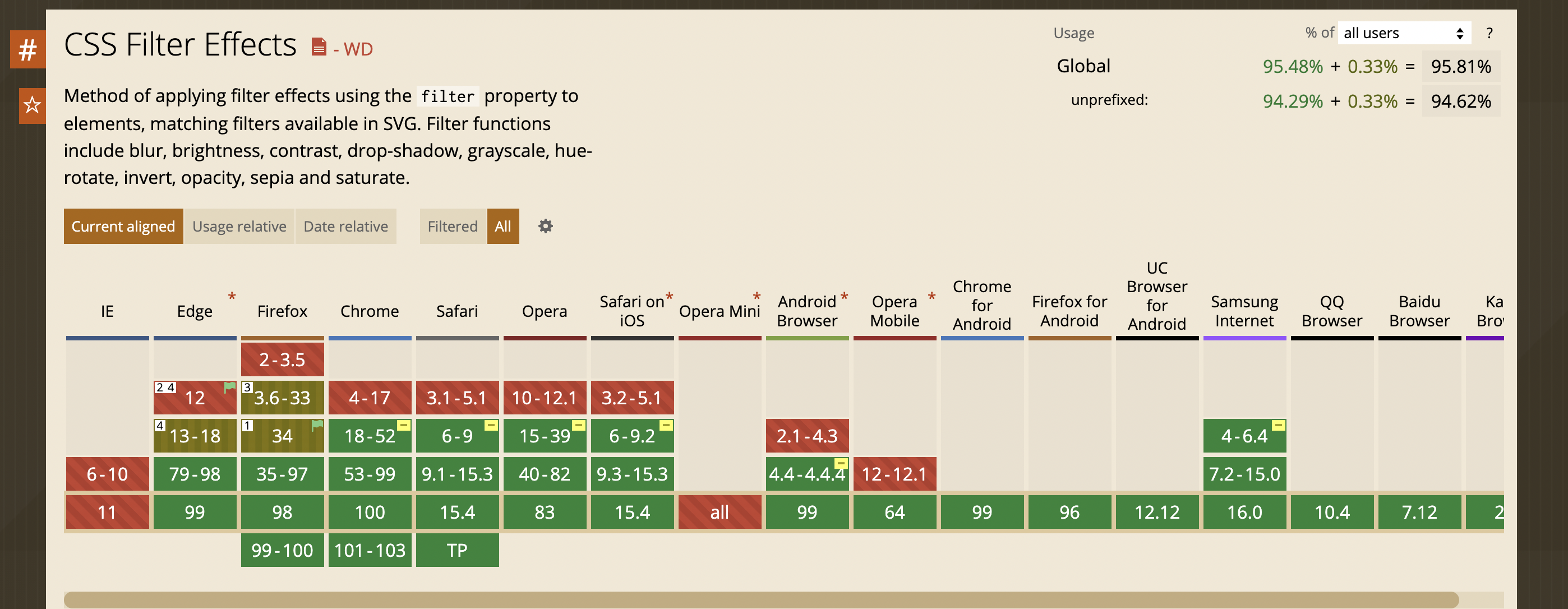
Browser support
Thanks for reading
Follow me on Twitter
Liked my content? Buy me a coffee to fuel my work. Thanks for reading!